
Tablet Screens Suit the Layout of an Online Casino Table
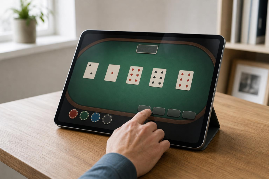
On a roulette table, a few millimeters can change the meaning of a selection. The middle of a numbered square, the line between two squares and the point where four meet each represent a different choice.
A touchscreen has to preserve those distinctions while making room for buttons, wager amounts and, in some games, dealer video.
That combination gives a tablet’s larger display a practical purpose: keeping the table and its controls readable together.
The Table Gives Every Part of the Screen a Job
Roulette makes the space requirements easy to see. Its numbered grid sits beside areas for red, black, odd, even and other selections.
A split covers two neighboring numbers; a corner covers four that meet at an intersection. The borders carry information just as the numbers do.
For a reader looking at tooniebet casino on a tablet, useful questions follow from that arrangement: are the numbers readable, are selection areas distinct, and are wager amounts easy to find?
ToonieBet, available to Canadian players outside Ontario, offers an iOS app and an Android web app, so the same table can appear in either environment.
Blackjack needs a different division of space. Cards and player positions occupy the table, with hit, stand, double and split controls nearby. Their placement should make it easy to connect the hand on display with the available decisions.
Turning the Tablet Changes the Available Room
Landscape orientation suits a long roulette grid or a spread of blackjack positions. Rotating the device gives these arrangements more horizontal room, with the gain depending on the screen’s proportions. The iPad A16 has a 2360 by 1640 pixel display.
Turning its rectangular screen from portrait to landscape increases the full-screen horizontal span by about 44%. The Galaxy Tab S10 FE, whose display measures 2304 by 1440 pixels, gains 60%.
That width allows elements to sit alongside one another. Portrait provides more vertical room for a stacked layout, such as video above the table.
Browser controls and app navigation also occupy space, so the table’s final dimensions depend on the window in which it appears.
Fingers Need Space Around the Controls
Seeing the table is only part of using it. Closely packed choices also need enough room for a finger to select the intended area. Roulette’s lines and intersections make that requirement particularly apparent.
Apple’s game-design guidance recommends a default tap target of 44 by 44 points on iPhone and iPad. Android recommends interactive targets of at least 48 by 48 density-independent pixels.
Both are ways of measuring an interface independently of its raw pixel count. The operating system translates those dimensions for the display, helping controls retain a consistent size across screens with different pixel densities. The area that responds to touch can include padding around a visible icon.
Spacing between adjacent controls also helps distinguish one action from the next. A tablet gives designers room for that padding, neighboring buttons and labels, while leaving the playing surface visible.
A Table Layout Has to Move With Its Window
Rotation changes the shape of the working area. Split-screen use and resized app windows can make it narrower still, even on a large tablet.
Android groups app windows by available width, using important boundaries at 600 and 840 density-independent pixels. Apple likewise recommends layouts that adapt to different window sizes, orientations and multitasking arrangements.
For a table interface, that could mean moving secondary information into a panel while retaining the cards or numbered grid and their main controls. Keeping familiar relationships between these parts helps readers follow the change.
The touch areas must move with them. In the US, Michigan’s internet gaming rules incorporate technical standards requiring resized interfaces to keep touch and click points aligned with what appears on screen.
Wagers, Help and Time Need a Place Too
Around the playing surface sit details that deserve attention: available funds, current wagers, completed-game results and help access. Live-dealer video adds another element to arrange. A larger display offers room to give each a recognizable place, with related controls and information grouped together.
Time deserves a visible place as well. Under the same Michigan rules, software must provide specified time information continuously or through a prominent notification at least every half-hour.
Responsible use includes setting time and spending limits, taking breaks and using available limit-setting or self-exclusion tools when needed. Local eligibility rules apply, including minimum age requirements that vary by province.
These details bring the layout back to its starting point. Every selection has a position, and every control needs room to work.
A tablet can accommodate that arrangement alongside the information needed to understand it, provided the design makes careful use of the screen.

Jim's passion for Apple products ignited in 2007 when Steve Jobs introduced the first iPhone. This was a canon event in his life. Noticing a lack of iPad-focused content that is easy to understand even for “tech-noob”, he decided to create Tabletmonkeys in 2011.
Jim continues to share his expertise and passion for tablets, helping his audience as much as he can with his motto “One Swipe at a Time!”